A collection of my reflections for EDCI 337

Category: Multimedia Learning

Module 5: Generative AI and its Future

Through this unit, we explored different forms of generative AI and how they can be used in unique ways. The first way I did so was by playing a Roleplaying Game (RPG). You may not correlate ChatGPT with playing games, but there are sites that have a plethora of copy and paste prompts that set up entire games for you to play (for free!). The prompt I selected led me on a thrilling adventure where I could alter the future by changing the past. What I noticed immediately was the accuracy of the generated text in depicting the world and time period outlined in the prompt. It felt as though I had stepped into a vividly imagined world, rich with detail. Below is a screen capture of my journey, but I won’t ruin the whole game. You can click here to try it for yourself. Simply copy the text and paste it into a ChatGPT conversation.

Image shows a conversation with ChatGPT. The user selected answer D) of a question not shown and says "he twists his ankle and falls over". ChatGPT responds by continuing its story and sharing how Neil Armstrong falls over on the moon before offering options of what to happen next.

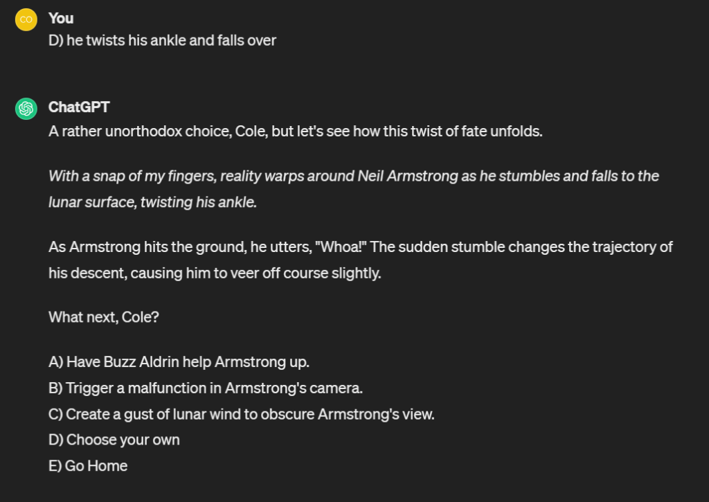
What truly captivated and surprised me (although perhaps it shouldn’t have) was the flexibility of the tool. While the initial prompt laid out the course of the game, my inputs allowed me to shape the narrative according to my desires. This level of customization added a layer of immersion and personalization that improved my gaming experience significantly. As someone with a background in gaming, I found this unique feature particularly appealing, as it allowed me to tailor the game mechanics to suit my preferences. It reminds me of basic typing games from the 80s and 90s where you are led on a simple story typing back and forth with a computer, however, this was exponentially more complex and was able to adjust on the fly.

Reflecting on my experience with generative AI applications, I noticed that I primarily use Language Models for educational purposes, but I’ve also dabbled in video and image creation tools – solely for enjoyment. Here is an AI recreation of one of my favourite cars of all time: Porsche GT3 RS. To generate this image, I prompted the AI to “Create a photorealistic rendering of a brown Porsche GT3 RS in a white studio”. This also highlights some of the shortfalls of these tools, as it completely ignored my input to make it brown.

AI generated image of a white Porsche GT3 RS well lit in a studio with windows on one side.

“Create a photorealistic rendering of a brown Porsche GT3 RS in a white studio” prompt, Stability AI, Stable Diffusion, Version 2.1, 27 March, 2024, https://stablediffusionweb.com/app/image-generator

I’ve yet to fully explore their potential for educational use, and I’m curious to see how they could be integrated into learning environments. The versatility of these tools are only limited to the imagination, and they offer exciting possibilities. I’m eager to see how they can enhance the learning experience in the future. Here is a TikTok sharing tips for incorporating image creation in the classroom setting.

TikTok video sharing how image creation can be incorporated into the classroom

In envisioning the future of these tools, I anticipate a continued evolution towards greater sophistication and accessibility. In 2-3 years time, we may see advancements in natural language processing, enabling more nuanced interactions and responses. Additionally, as these tools become even more common, there will be a growing emphasis on addressing ethical concerns such as bias and privacy protection.

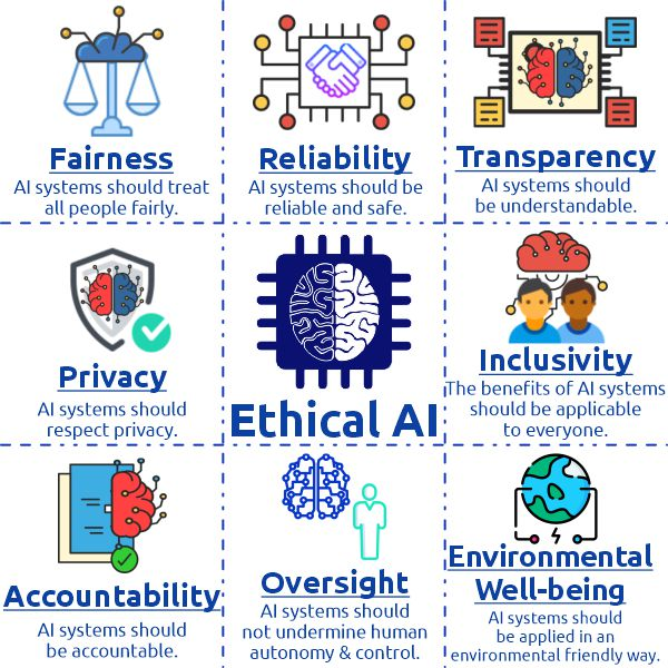
One of these ethical concerns surrounding the integration of AI in education revolves around issues of equity, bias, and privacy. As AI algorithms learn from historical data, there’s a risk of perpetuating existing biases present in educational materials or assessment criteria – especially considering a large part of the training material comes from western culture. This could lead to disparities in educational opportunities and outcomes, reinforcing systemic inequalities. Moreover, the collection and analysis of student data by AI systems raise concerns about privacy and data security. Without safeguards in place, there’s a risk of unauthorized access, misuse, or exploitation of sensitive student information. Thus, it’s very important to establish clear ethical guidelines to ensure that AI technologies in education uphold principles of fairness, transparency, and respect for student privacy. Below are some of the aspects that I believe should be considered when creating these guidelines:

Image shows a 3 by 3 grid with Ethical AI written in the centre. It shows the most important aspects of ethics in artificial intelligence: fairness, reliability, transparency, privacy, inclusivity, accountability, oversight, and environmental well-being.

Another tool we learned about was the SECTIONS model. Applying the SECTIONS model to the use of media as a learning opportunity and creative tool in this course, I can now see the complexity of taking certain factors into account, such as teaching functions and organizational issues. While video can be a powerful way of conveying information, evaluating its effectiveness requires careful consideration of its alignment, specifically with learning objectives and the resources available. Despite the challenges, I’ve witnessed first-hand how integrating video into this course has enhanced my engagement and facilitated a deeper understanding of course content.

Module 4: Learning about Learning Design

Traditionally, my academic journey, much like that of many others, was largely stale and uninteresting – even if the content itself excited me. This course, however, changed that. The combination of exploring resources (passive learning) with interactive, hands-on assignments/blogs (active learning) has created an enjoyable engagement with the content. Unlike in previous courses, where the passive components often felt disengaged from the practical applications, this class wove them together in a manner that enriched my understanding and retention of the material.

One method of learning design I’ve encountered before is Scaffolding. An example of effective scaffolding I experienced came from a project that required us to develop a small-scale research proposal. Initially, we were introduced to the foundational concepts through readings and lectures, allowing us to passively absorb the necessary knowledge. After that, we engaged in discussions that challenged us to apply these concepts actively in hypothetical scenarios. Gradually, the tasks increased in complexity, leading us to design a research question and methodology. Finally, instructor feedback before the final submission acted as the last scaffolding step. This step-by-step escalation not only built our confidence but also deepened our comprehension by continuously connecting theory with practice.

Lesson Plan and Interactive Video

One issue that is very important to me is fast fashion. As someone who enjoys the world of clothing, I often notice how the dark side of the industry gets overshadowed by flashy shows and releases. Because of this, I designed my lesson plan and interactive video to be educational on this topic. I started with backwards design, asking myself the big question: what would I want the students to get out of this. After working backwards through the steps, I was pleased that I had created a lesson plan that adequately supported and engaged students from start to finish, without overwhelming cognitive load, engaging with material they aren’t familiar with, or leaving anyone behind. Through this plan, students would be able to work their way through Bloom’s Taxonomy, from being able to simply understand what fast fashion is, to being able to create solutions based on evaluation. Take a look for yourself below.

Check out the interactive video I created below to learn more about this issue!

My exploration of H5P as a tool for integrating active learning into the educational experience was eye opening. Its fun and interactive nature showed significant upside in learning potential, making the educational process both engaging and effective. I tended to use multiple-choice questions to encourage deeper thinking among students. By creating scenarios that mirrored real-life decisions, I was able to spark critical thinking and relate the learning material to the real world. However, I noticed a lack of ability to allow students a short answer written response. I would have liked to ask more open ended questions to see where their minds end up. Perhaps this is a feature that I could not find, but I would love to keep exploring this tool!

Assignment 2: Video for a Learning Purpose

I chose to create an educational video on the loss of identity that high-level athletes experience when leaving their sport behind. Accessible captions are provided.

Here is a link to the script and storyboarding process than went into the creation of my video.

Finally, here is my reflection on the entire journey.

I hope you enjoyed, feel free to leave a comment down below about your experience getting a look into my work and process!

Module 3: Crafting Meaning Through Stories and the Power of Personal Narrative

One of the most impactful learning experiences I encountered began with a simple yet impactful story. It was back in high school during woodshop class, where our teacher began his lesson about safety practices regarding the various pieces of equipment around the shop. However, it wasn’t because of the technical details that it left a lasting impression; it was the story he shared. In order to illustrate his point, he recounted the day he had an unfortunate encounter with a bandsaw, resulting in the loss of one of his fingers. As he spoke, he lifted his hand, revealing the stub where his finger once was. Instantly, the room fell silent as the visual impact of his story sunk in. This narrative appealed strongly to the visual sense, as the image of his injury was vividly etched into our minds. Reflecting on this experience, I recognized several storytelling techniques at play, some of which were highlighted in recent readings for this course.

Firstly, our teacher effectively engaged us by sharing his personal story, making the lesson more relatable and memorable. Secondly, he adhered to the principle of “show don’t tell,” allowing the physical evidence of his injury to convey the severity of the situation better than any verbal description could. Finally, he concluded his narrative with a positive takeaway, emphasizing how his experience had motivated him to prioritize safety and help others avoid similar accidents. This combination of storytelling techniques not only made the lesson more engaging but also instilled a deeper understanding of the importance of safety protocols in woodworking.

The storytelling techniques he used were also employed by the TED Talk by Zak Ebrahim, “I am the son of a terrorist. Here’s how I found peace”. I found his presentation particularly compelling. Ebrahim’s talk exemplified several storytelling techniques, including the use of personal narrative to captivate the audience and the incorporation of suspense to maintain interest throughout his story.

Embedded YouTube video of Zak Ebrahim’s TedTalk. Click on the video to watch.

While I have instinctively employed techniques such as sharing personal stories, employing “show don’t tell,” and creating suspense in my own storytelling, I can always refine my skills further. One technique I aim to focus on moving forward is building up to a S.T.A.R. moment, as it can add significant impact and resonance to narratives.

My Exploration of Twine Story Creation

Exploring branched narratives like Twine offers learners a unique learning experience characterized by interactivity and choice. By allowing individuals to navigate through different paths and outcomes based on their decisions, branched narratives allows for critical thinking, problem-solving, and exploration in a dynamic and engaging manner. One added benefit of Twine is that it is very accessible for those who may not have any coding experience but still want to build a story of their own! Branched narratives are not limited to educational platforms like Twine; they are prevalent in many forms of media and entertainment, including video games, interactive fiction, and immersive experiences.

Screengrab taken from Twine. Image shows a cluster of 11 close dots with three more dots slightly separated to the left. Beside the dots is the title "EDCI337" with "Last edited on 2024-02-20" and "14 passages" written below.

Above is an image showing a “heat map”, if you will, of the short story I built in Twine. I created a short choose-you-own-adventure type game revolved around a morning in my life. Only a few paths result in reaching the bus stop in time but there are several ways to do so.

On a grid, 14 boxes are shown. Each both has a title and choices with arrows indicating potential paths between each option. The majority of paths lead back to "ZZZ"

As you can see, I attempted to create the story to have several loops and shortcuts, with the majority of options leading back to falling asleep again! I thoroughly enjoyed this part of the course, but it was very time consuming with a steep learning curve to employ advanced features. If I had unlimited time to explore all of the options and tools provided by Twine, it would be exciting to see what I could create.

Module 2: Prioritizing Accessibility in Design

I’ve noticed that in digital content creation, ensuring accessibility has become more and more important. Accessibility is no longer a checkbox to mark off; it’s a fundamental aspect of inclusive design that breaks down barriers and ensures that everyone, regardless of ability, can engage with (and benefit from) the content presented. Through this module, we’ve explored and learned how to integrate accessibility into the design process, recognizing its potential in creating a better online experience for all users. In this post, I will share my journey in learning how to make my designs accessible for all.

How Accessible is this Blog?

Below is a screen capture of my score from the WAVE accessibility report I ran on my first blog post. While I have added a description, it is not displayed for me when viewing this post, and this is an issue I will be looking into in the future.

The image shows a screengrab of a blog page with the title "Enhancing Learning through Multimedia: Applying Cognitive Theory Principles". On the left side of the screen is a menu that reads: 0 errors, 13 contrast errors, 2 alerts, 7 features,  and 25 structural elements.

Running the WAVE accessibility report was an eye-opening experience. I expected to find a few issues, but I was pleasantly surprised to discover that the majority of my blog was already quite accessible. Only two main issues stood out: an embedded YouTube video and a button to return to the previous post. These issues, while not severe, are still worth addressing to enhance accessibility further. The real issue I encountered was the lack of contrast in the side menu button colors, which is easily fixable.

Exploring Text-to-Speech Tools

I have experimented with Text to Speech tools before. Personally, as a visual learner, I find the voice distracting while reading. However, I do appreciate subtitles and captions on videos. Trying out different voices didn’t significantly change my experience, but I noticed that a low male voice was the least distracting, perhaps because it resembled mine and I was therefore more used to it.

What is Accessibility in Design?

I believe that accessible design essentially means ensuring everyone can engage with content regardless of ability. Inclusive design, to me, means more than compliance—it’s about empathy and understanding diverse needs. It’s about creating seamless, intuitive experiences for all users, considering differences in age, culture, ability, and technology proficiency.

One thing I’ve learned through this unit is that inclusive design benefits everyone, not just those with disabilities. It’s a collaborative effort, involving diverse perspectives throughout the design process. In the end, I believe it’s about fostering a digital environment where everyone feels valued and included. By embracing inclusive design, we create a more equitable online experience for all.

Designing an Infographic

Below is the final product of my infographic. I chose to design a graphic informing the general public on the often overlooked benefits of drinking water. This was unfortunately the highest resolution download option, and while I have added a description, it is not displayed for me when viewing this post, and this is an issue I will be looking into in the future.

Infographic titled "5 Reasons you should drink more water". The reasons listed are as follows: improves blood oxygen circulation, helps remove waste by helping the kidneys, aids digestions, reduces risk of injury, and improves cognitive function.

Recently, I created an infographic on the benefits of drinking water using Canva. In its design, I incorporated several principles.

Proximity: I was very particular with the spacing within the boxes both with the text and the visuals.

Repetition: This document is very satisfying to look at (in my opinion) and this is partially due to the repetition. The square pattern allows the infographic to be very easy to comprehend and follow.

Alignment: Each textbox is aligned with the one above it, this creates cohesion throughout the design.

Size: All five components are equally sized to indicate equal importance, while the title is sized in a way to create impact and to convey the most important message.

Balance: The back and fourth nature of the squares creates a flow that allows the eyes of the reader to easily fall down the page in a logical manner.

These principles helped organize the information effectively and make it visually appealing. However, when creating infographics, I believe that it is crucial to consider how to ensure accessibility for learners with visual impairments. While graphic design is inherently visual, additions like alternative text description for this graphic and other accessible choices can make the content more inclusive.

How Can Infographics Stay Accessible?

To ensure that learners with visual impairments have access to the same information in infographics, here are several of the most important (in my opinion) modifications can be made:

  • Alt text descriptions: Providing descriptive alt text for images and graphics allows screen readers to convey the information to visually impaired users.
  • Text alternatives: Including text-based alternatives for visual content, such as charts or diagrams, ensures that all users can access the information.
  • Readable fonts: Choosing clear, legible fonts and avoiding overly stylized text ensures that the content is easy to read for everyone.


In conclusion, prioritizing accessibility in website design is essential for ensuring that all users can access and engage with the content. By considering diverse needs and using inclusive design principles, we can create a more equitable online experience for everyone. As I move forward with this blog, I am keeping accessibility at the forefront of my design decisions, ensuring that everyone can enjoy and benefit from the content I share.

Collection of Comments

Below are links to my comments on group member’s blog posts:

Module 1:

Module 2:

Module 2 – Design Principles for Effective and Accessible Multimedia – SYD’S BLOG (opened.ca)

Module 3:

Module 3 – Storytelling and Video Creation – Kat’s Blog (opened.ca)

Module 4:

Module 4: Principles of Learning – keifer337 (opened.ca)

Module 5:

Blog Post 5: Generative AI and Evaluating Content and Tools for Learning – edci 337 Amira El-Hafi (opened.ca)

Module 1: Applying Cognitive Theory Principles

In the realm of educational technology, the Cognitive Theory of Multimedia Learning serves as a guiding framework for creating effective learning materials. This blog post explains my thought process and learning through the creation of a screencast. I created an accessible presentation on one of my passions: Formula 1 racing. Whether you know a little or a lot about the sport, I hope you enjoy and learn something new. Accurate captions are provided.

Intuitive and Surprising Aspects of Multimedia Learning Principles

Personally, the Pre-Learning principle struck a chord with me. I’ve often found myself struggling when learning new content when I am not comfortable with either the basics or the necessary terminology. On the other hand, the Voice principle surprised me. I hadn’t expected a noticeable difference between a human and robotic voice in terms of facilitating learning.

Applying Principles in my Screencast

When creating my screencast, I aimed to weave in as many Cognitive Theory principles as possible. The signaling principle became my go-to, using arrows to highlight elements in real-time and aligning seamlessly with the Temporal Contiguity principle for maximum efficacy. Breaking down the complex subject of Formula 1 into digestible chunks also showed the Segmenting principle. Additionally, I used the Spatial Contiguity principle by placing labels directly beside relevant graphics.

Audience Consideration

My audience for the screencast was intentionally broad, seeking to make the content accessible to a diverse range of viewers. To keep learning levels high, I prioritized simplicity in graphics, as overly complex visuals might hinder understanding, especially for those unfamiliar with Formula 1.

Experiences and Learnings

Reflecting on past experiences, I’ve consistently followed the Segmenting principle, breaking down information into manageable sections. However, the signaling principle, which proved highly effective in the screencast, wasn’t a conscious consideration for me before. Moving forward, I would like to integrate the signaling principle more consistently, as its potential to enhance information conveyance is often-overlooked.

My exploration of the principles of Cognitive Theory of Multimedia Learning has provided valuable insights into intentional design for learning. Through my experience in my screencast creation, it’s clear that applying these principles not only enhances the learning experience but also broadens the accessibility of content for a diverse audience. As technology continues to shape education (both in person and online), I can now see how understanding and embracing cognitive principles can significantly contribute to the effectiveness of instructional materials.