I’ve noticed that in digital content creation, ensuring accessibility has become more and more important. Accessibility is no longer a checkbox to mark off; it’s a fundamental aspect of inclusive design that breaks down barriers and ensures that everyone, regardless of ability, can engage with (and benefit from) the content presented. Through this module, we’ve explored and learned how to integrate accessibility into the design process, recognizing its potential in creating a better online experience for all users. In this post, I will share my journey in learning how to make my designs accessible for all.
How Accessible is this Blog?
Below is a screen capture of my score from the WAVE accessibility report I ran on my first blog post. While I have added a description, it is not displayed for me when viewing this post, and this is an issue I will be looking into in the future.
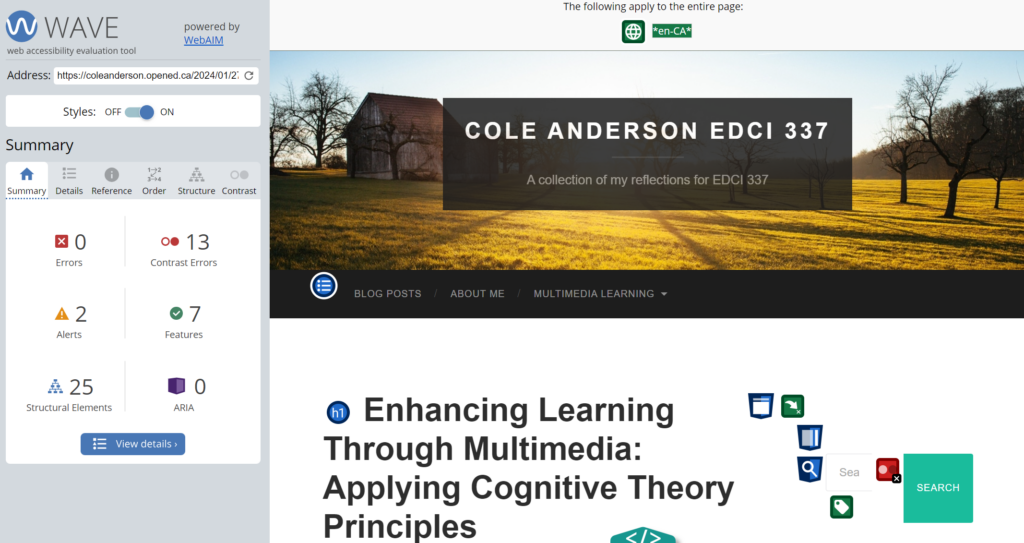
Running the WAVE accessibility report was an eye-opening experience. I expected to find a few issues, but I was pleasantly surprised to discover that the majority of my blog was already quite accessible. Only two main issues stood out: an embedded YouTube video and a button to return to the previous post. These issues, while not severe, are still worth addressing to enhance accessibility further. The real issue I encountered was the lack of contrast in the side menu button colors, which is easily fixable.
Exploring Text-to-Speech Tools
I have experimented with Text to Speech tools before. Personally, as a visual learner, I find the voice distracting while reading. However, I do appreciate subtitles and captions on videos. Trying out different voices didn’t significantly change my experience, but I noticed that a low male voice was the least distracting, perhaps because it resembled mine and I was therefore more used to it.
What is Accessibility in Design?
I believe that accessible design essentially means ensuring everyone can engage with content regardless of ability. Inclusive design, to me, means more than compliance—it’s about empathy and understanding diverse needs. It’s about creating seamless, intuitive experiences for all users, considering differences in age, culture, ability, and technology proficiency.
One thing I’ve learned through this unit is that inclusive design benefits everyone, not just those with disabilities. It’s a collaborative effort, involving diverse perspectives throughout the design process. In the end, I believe it’s about fostering a digital environment where everyone feels valued and included. By embracing inclusive design, we create a more equitable online experience for all.
Designing an Infographic
Below is the final product of my infographic. I chose to design a graphic informing the general public on the often overlooked benefits of drinking water. This was unfortunately the highest resolution download option, and while I have added a description, it is not displayed for me when viewing this post, and this is an issue I will be looking into in the future.
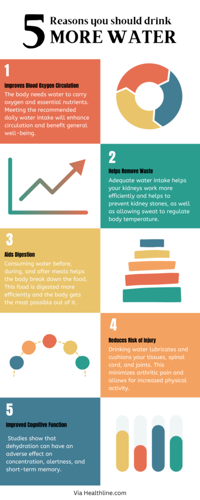
Recently, I created an infographic on the benefits of drinking water using Canva. In its design, I incorporated several principles.
Proximity: I was very particular with the spacing within the boxes both with the text and the visuals.
Repetition: This document is very satisfying to look at (in my opinion) and this is partially due to the repetition. The square pattern allows the infographic to be very easy to comprehend and follow.
Alignment: Each textbox is aligned with the one above it, this creates cohesion throughout the design.
Size: All five components are equally sized to indicate equal importance, while the title is sized in a way to create impact and to convey the most important message.
Balance: The back and fourth nature of the squares creates a flow that allows the eyes of the reader to easily fall down the page in a logical manner.
These principles helped organize the information effectively and make it visually appealing. However, when creating infographics, I believe that it is crucial to consider how to ensure accessibility for learners with visual impairments. While graphic design is inherently visual, additions like alternative text description for this graphic and other accessible choices can make the content more inclusive.
How Can Infographics Stay Accessible?
To ensure that learners with visual impairments have access to the same information in infographics, here are several of the most important (in my opinion) modifications can be made:
- Alt text descriptions: Providing descriptive alt text for images and graphics allows screen readers to convey the information to visually impaired users.
- Text alternatives: Including text-based alternatives for visual content, such as charts or diagrams, ensures that all users can access the information.
- Readable fonts: Choosing clear, legible fonts and avoiding overly stylized text ensures that the content is easy to read for everyone.
In conclusion, prioritizing accessibility in website design is essential for ensuring that all users can access and engage with the content. By considering diverse needs and using inclusive design principles, we can create a more equitable online experience for everyone. As I move forward with this blog, I am keeping accessibility at the forefront of my design decisions, ensuring that everyone can enjoy and benefit from the content I share.
Leave a Reply
You must be logged in to post a comment.